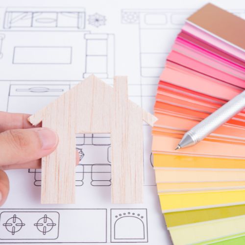
Color is a fundamental element of home design used to create a harmonious flow. In interior design, “flow” refers to the visual connections that link together different rooms of a home to create a cohesive aesthetic. Creating a flowing color story takes planning and strategy from the remodeling to the decorating stage. Here are our best tips to elevate your home’s design with a cohesive color flow.
Selecting a Consistent Neutral
Perhaps the most essential hue in your home’s color palette is its main neutral shade. This shade is painted on most walls that connect multiple rooms, like in common spaces or hallways. Although neutral shades are typically white, off-white, tan, or gray, you can choose a subtle shade of bolder hues like sage green or baby blue. Whatever color you choose, be sure it complements other secondary and accent colors in your home.
Create Color Repetition
Along with your chosen neutral color, you will want to select home features to repeat other complementary colors. For example, using the same color curtains in your living room as your dining room can create a sense of unity between them. You can apply this technique to virtually any fixture, piece of furniture, or decoration. It is also a good rule of thumb to choose one color for your entire home’s trim for consistency.
Play With Contrast
Within a cohesive color palette, you can play with contrasting hues to create visual intrigue. You can accomplish this by choosing complementary (meaning opposite) or triadic colors found on the color wheel. A room made of many similar hues and shades can feel flat without a bold accent color. The best way to introduce bold, contrasting colors is with home accessories and decorations. Pops of color in decor and artwork reflect your personal tastes and turn your house into a home.
Pick Your Favorite Materials and Finishes
Wood furniture and metal finishes tend to be overlooked when choosing a color scheme. But these elements should also appear visually consistent from room to room. Try to keep metal hardware in your bathroom, kitchen, and other fixtures all the same material and finish. Upgrading your hardware to match your decor is a small detail that elevates your home’s design.
Consider the 60-30-10 Rule
One rule some interior designers use to balance different colors and shades within a design plan is the 60-30-10 rule. This rule can help you create a cohesive palette using three to five colors strategically. When looking around your home, roughly 60 percent of its interior should be a neutral base color. Around 30 percent should be a secondary color and an optional shade of the same hue. Lastly, 10 percent of your home is made up of a contrasting accent color. Adding any more than four or five colors in your main color scheme can disrupt the flow between rooms.
These strategies can help give your home a more cohesive appearance. Color is a powerful tool for conveying a mood or energy throughout different rooms.