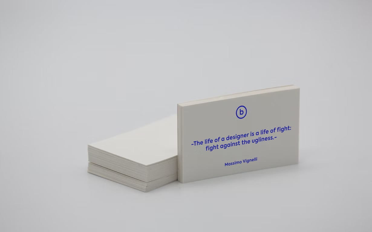
The business card has been successfully holding the leading position among printed products over the past decades. Yes, the popularity of email, coupled with scientific and technological progress, continues to supplant personal contact. But, despite this, the tradition of exchanging business cards between people remains an unchanged ritual, which becomes the starting point for future cooperation.
However, not every business card is able to favorably affect the reputation of its owner. It all depends on the stylistic design. Let’s try to figure out what nuances you need to know when printing business cards.
Style
A business card, like outdoor advertising, has a few seconds at its disposal to attract attention. Therefore, stylistic design plays an important role. Designers recommend using unusual materials for printing business cards (for example, transparent plastic), bright color combinations, embossing, etc.
If earlier business cards were “strictly business”, then in recent years they have become more… talkative. Perhaps this is part of a larger trend towards personalized interactions, or over the past couple of years, people have simply missed the casual chat.
Even if it’s about some serious industry, text that resembles an informal conversation will help show the human face of your business. The challenge is to create a friendly and attractive image by adding lettering to business cards that will be perceived as a normal conversation.
Another trend is bubble letters, created by legendary graffiti artist Phase 2, often associated with 1970s design. Originally called “soft” these fonts are making a comeback in 2022 with a slightly modified ultra-bright look.
Repeating patterns have always been popular with business card designers. In 2022, we will see a lot of linear compositions. Imagine that you meet someone giving you a card like a Joy Division album cover.
Like other trends, this one demonstrates the rejection of conventional wisdom. At the same time nostalgic and modern, the line graphics look quite sharp and provocative, especially the messy chaotic drawings on a black background. More serious companies can mitigate this effect a little by using curves.
So, take a Photoshop business card mockup and adjust it to the newest tendencies.
Material
Today, printers provide many interesting and innovative solutions, such as transparent plastic, wood, slate paper, etc. Such cards are suitable for fans of innovation. Henchmen of the classics need to follow a few rules:
– Use high-density paper. It not only extends the life of business cards but also shows a serious approach to customers or partners.
– Pay attention to the surface of the paper. Printers offer two options – matte and glossy surface. To give the product a glossy sheen, a glossy film is used. Its advantage lies in the fact that it makes the colors of the printed product more saturated and deep. This option is perfect for clients working in the field of cosmetology, trade or advertising business, where the appearance of a business card should convey the meaning of the message through a graphic image.
Matte lamination is a kind of conservative solution. It combines rigor and elegance without pretentious beauty. Therefore, matte business cards will be relevant for representatives of economic business, managers, and other people who want to emphasize the seriousness of their work.
The service life of matte business cards is quite long. They are hard and dense, don’t break or lose color, remaining an elegant addition to the image of their owner for many years.

Summary
Any business card should do at least one thing – make it easy for people to contact you – but it can do so much more. As a branding element, your business card determines what people think of you, especially when it comes to first impressions.
It is not enough just to bring together different trends. The task of the designer is to choose only those solutions that suit your brand and evoke the right associations.

